 Cecil Campbell
Grasp Concepts: helping university students see what they don't know
Turning a 42-item concept list into a weekly path for students, with resources their lecturers trust. Piloted at Imperial College London, with UCL as a partner.
Chapter 1
Overview
Grasp Concepts turns a university module into a map of concepts. Each concept has a plain description, the prerequisites you need first, and the best video and text resources to learn it. It serves two groups: students working through a module, and the lecturers who teach it and decide which resources to recommend. We built it with Dr Konstantinos Gkoutzis at Imperial College London and Prof. Elinor Jones at UCL.
The problem
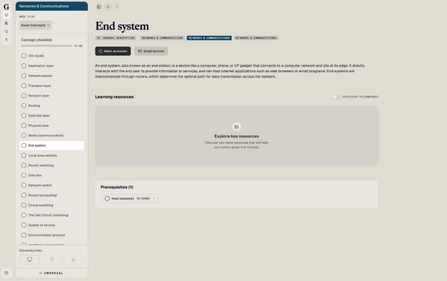
Students opened a module and saw a flat checklist of 42 concepts, 0 done. Learning resources were hidden behind a button, and nothing showed which concepts depended on which. As one of our principles put it: you don't know what you don't know.
Outcomes
- 20–35% of students on Imperial's 2024 Networks and Communications module (Department of Computing) used it
- The checklist went from 42 concepts at once to a weekly chunk of about 3
- In an A/B test, leading with the description and collapsing prerequisites increased resource opens by 12%
Chapter 2
Role & constraints
Product Designer, and the only designer at Grasp, working in one-week delivery cycles with the founder and engineering team. I partnered with university professors as senior stakeholders, turning their prerequisite concept maps into user journeys, and designed the information architecture, the concept page, the resource experience, the sidebar and the product tour, through to dev handoff and build review.
2.1How I worked
Senior academic stakeholders
Worked with professors at Imperial and UCL to map how a module is taught, where students get stuck, and what lecturers need to stay in control of content.
Qualitative and quantitative evidence
Combined student and lecturer interviews with pilot usage data and an A/B test, so design decisions rested on more than one signal.
Artefacts that travel
Information architecture maps for both audiences, user flows, trade-off tables and clickable prototypes, used to align academics, the founder and engineers.
Agile, product-led delivery
Prototyped early, shipped in one-week cycles, and reviewed every build against the designs before it reached students.
- Content comes from real modules, so the structure has to survive messy lecture material.
- Resources come from the open web, so students need signals to trust them.
- Lecturers stay in charge: recommendations and descriptions are theirs.
Chapter 3
Discovery
3.1Two audiences, one structure
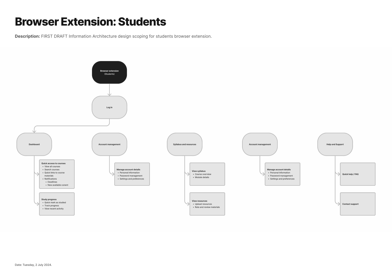
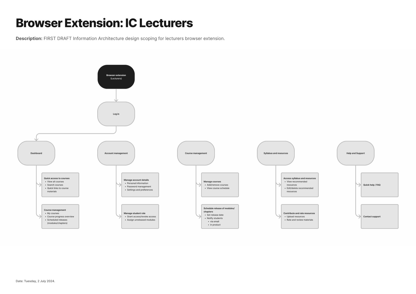
I started by mapping the information architecture for each audience. Students need to move through a module week by week; lecturers need to curate concepts, write descriptions and recommend resources. Mapping both side by side showed where their needs met: the concept page.
3.2A student's week, mapped
I mapped a typical module week from the student's side, using what students and lecturers told us. Confidence dropped twice: when the whole module landed at once, and when a student had to judge an unfamiliar resource.
Archetype: a second-year computing student. Wants to keep up with this week's lectures without drowning in material.
3.3A checklist that started at 0/42
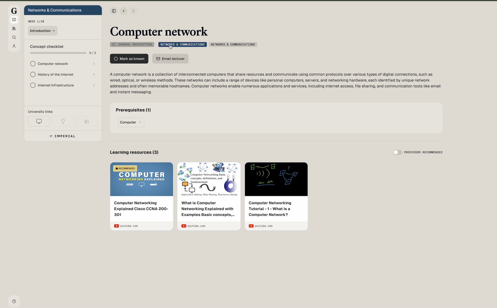
The production build (October 2024) listed every concept in the module at once. Resources sat behind an "Explore key resources" button, below the fold. Students had no starting point and no sense of an end.
3.4What does a student need to trust a resource?
Before designing resource cards, I listed the questions a student asks in the second before they click:
| Question | What answers it |
|---|---|
| What is it about? | Title and thumbnail |
| Can I trust it? | Lecturer-recommended badge, views or rating |
| What is it? | Icon, source and format |
| Where is it from? | Source name and icon |
| How long will it take? | Duration and key moments |
| What will I have to do? | A short preview or description |
3.5Trade-offs we debated
| Idea | For | Against |
|---|---|---|
| Marking a parent concept as known also marks its children | Learners can quickly mark lots of concepts | They can falsely mark concepts as known, much faster than before |
| Numbering the concept checklist | A visual guide to work through in order | Imposes a linear flow that may not suit every learner |
3.6The prerequisite rabbit hole
Prerequisites are powerful, but each one has its own prerequisites. Students could fall down a chain and never return. We explored ways to limit the depth shown and ran an A/B test on how prominent the description should be and where prerequisites sit. The version with the description first and prerequisites collapsed led to 12% more resource opens, so we shipped it.
Learning one concept
Chapter 4
Solution
4.1A week at a time
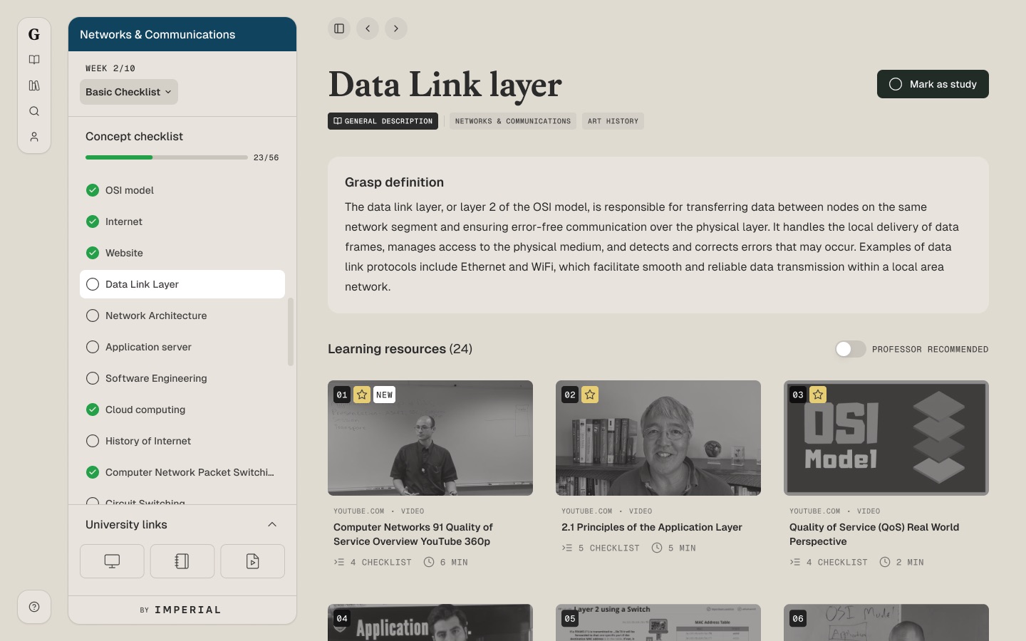
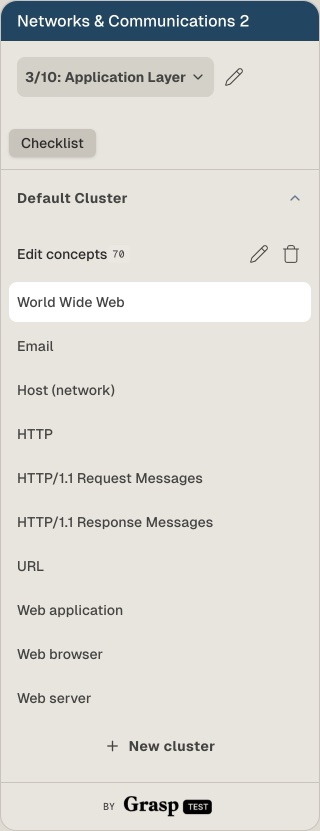
The checklist now shows one week of a ten-week module, with progress for that week only. The concept page leads with a short description, then prerequisites, then resources, all on one screen.
4.2Resource cards that earn trust
Every card answers the trust questions at a glance: source, format, title, and a Recommended badge when the lecturer has picked it. A Professor recommended toggle filters to the lecturer's picks.
4.3Learn without leaving
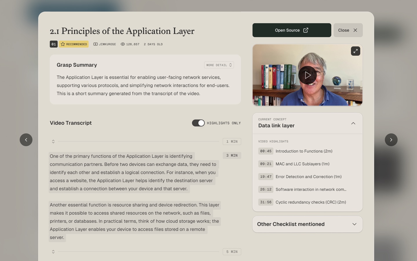
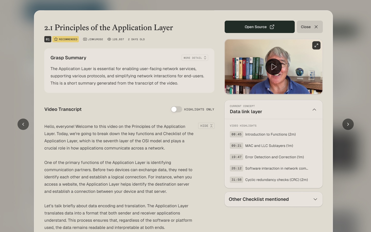
Resources open inside Grasp with the transcript alongside, so students can skim, jump to the moment that matters, and return to the concept.
4.4A clearer sidebar
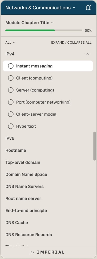
The sidebar was redesigned on Grasp's shadcn/ui-based design system, with separate menus for students and lecturers and room for search. New patterns such as the resource card and weekly checklist were designed as reusable components, so they stayed consistent across the web app and the browser extension.
4.5Lecturers in control
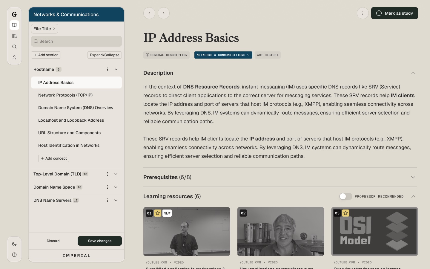
Lecturers are users too. In edit mode they reorganise a module into sections, add concepts with a search command, and save or discard changes, with a confirmation and a toast so nothing changes for students by accident.
4.6Checking understanding
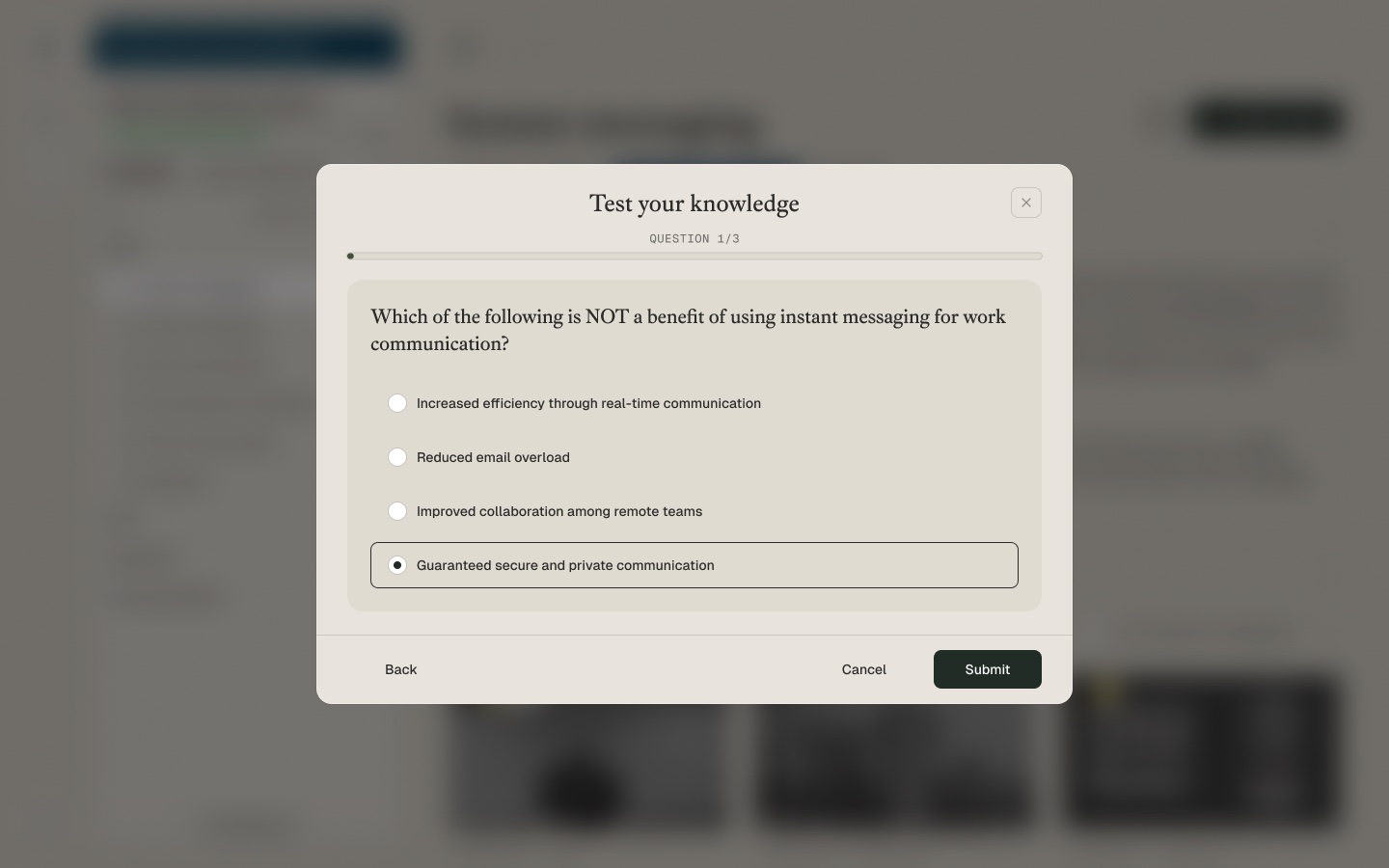
Marking a concept as known is a self-report. I explored a short quiz that students can open from the concept page: pick topics, answer a few questions, and see results with feedback on anything they got wrong.
4.7Getting started
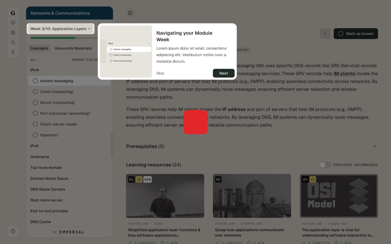
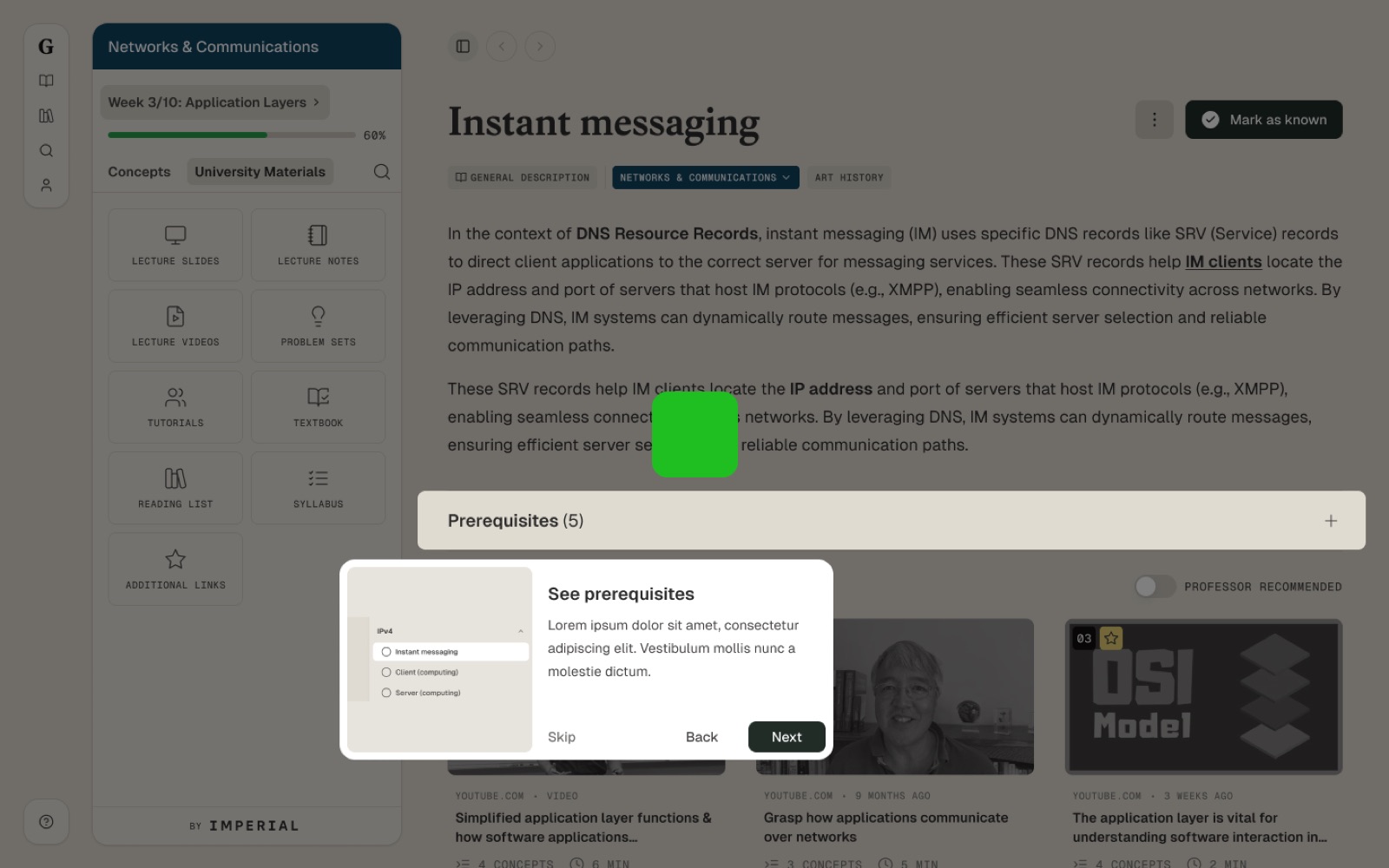
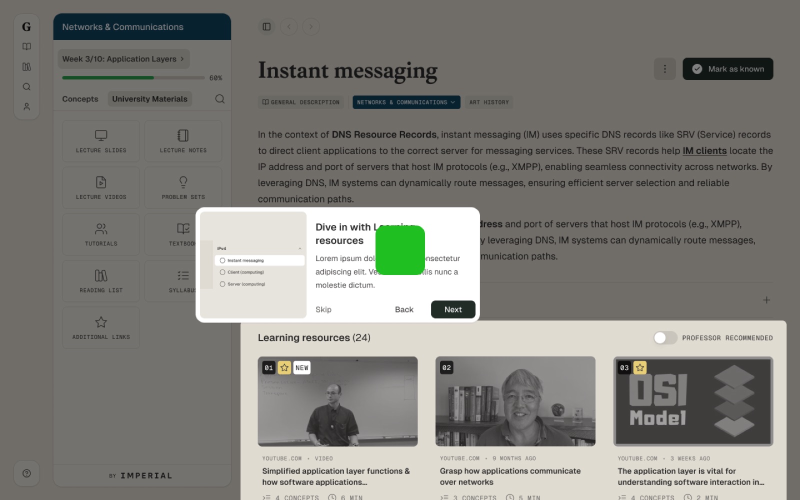
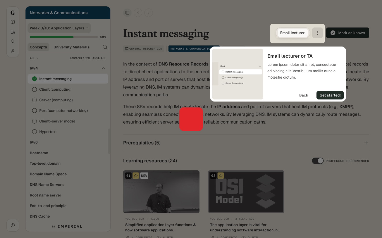
A short product tour walks new students through the core actions: navigating the week, checking prerequisites, using resources and emailing the lecturer.
4.8Accessible and inclusive by design
Students on a module have different needs: some are non-native speakers, some learn better by reading than watching, some study on a phone between lectures. These decisions were made with WCAG 2.2 AA in mind:
| Decision | Who it helps | WCAG 2.2 |
|---|---|---|
| Transcripts open beside every video resource | Deaf and hard-of-hearing students, non-native speakers, anyone who prefers to skim | 1.2 Time-based media |
| Recommended resources are labelled in text, not just colour | Colour-blind students and screen-reader users | 1.4.1 Use of colour |
| One week at a time, with plain-language descriptions first | Students who are overwhelmed by long lists, including neurodivergent learners | Beyond AA: W3C cognitive accessibility guidance (COGA) |
| Consistent navigation between the web app and extension | Everyone, especially keyboard and screen-reader users | 3.2.3 Consistent navigation |
4.9On mobile
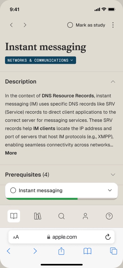
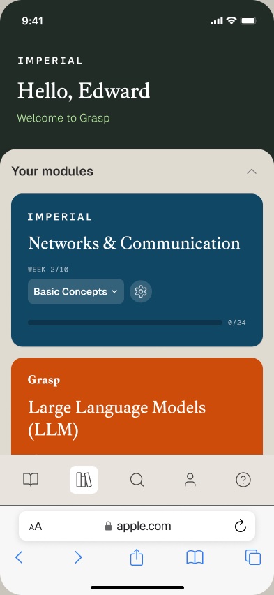
Concepts started on desktop and in the browser extension. I explored how it works on a phone between lectures: a student dashboard that groups modules by university, and a concept page where the description, prerequisites and resources stack in reading order.
Chapter 5
Results
Students who used it came back week after week, using the checklist to plan their study. They said the weekly view made the module feel manageable, and that seeing which resources the lecturer recommended saved them time searching. For our academic partners, the IA maps and prototypes made it easy to see how their teaching would appear to students, which built the trust to extend the model from the Imperial pilot to UCL with Prof. Elinor Jones.
Chapter 6
Reflection
Less is more for learners. Showing all 42 concepts at once was accurate but overwhelming. Chunking by week didn't remove any content. It changed where students started, and that was enough to get them moving.
Trust is a design problem. Students didn't distrust the content; they distrusted not knowing where it came from. Source, format, length and a lecturer's recommendation answered most of their questions before they clicked.
Staff are users too. Lecturers weren't just stakeholders to sign off designs; they were users with their own journey. Designing for both audiences, and showing each how the other would experience the product, is what made the partnership work.
What I'd do differently. I'd bring lecturers into testing earlier. They were our partners on content, and watching students use the product would have shaped how they wrote descriptions and chose recommendations.