 Cecil Campbell
Tutor onboarding that feels shorter than it is
Moving a long, compliance-heavy sign-up from mobile web into a guided app wizard, then testing it with tutors before launch.
Chapter 1
Overview
Tutorful is a UK tutoring marketplace. Before a tutor can teach, Tutorful needs their ID, background check, qualifications, subjects, rates, availability and a profile. That's a lot to ask of someone who just wants to earn some extra money.
The problem
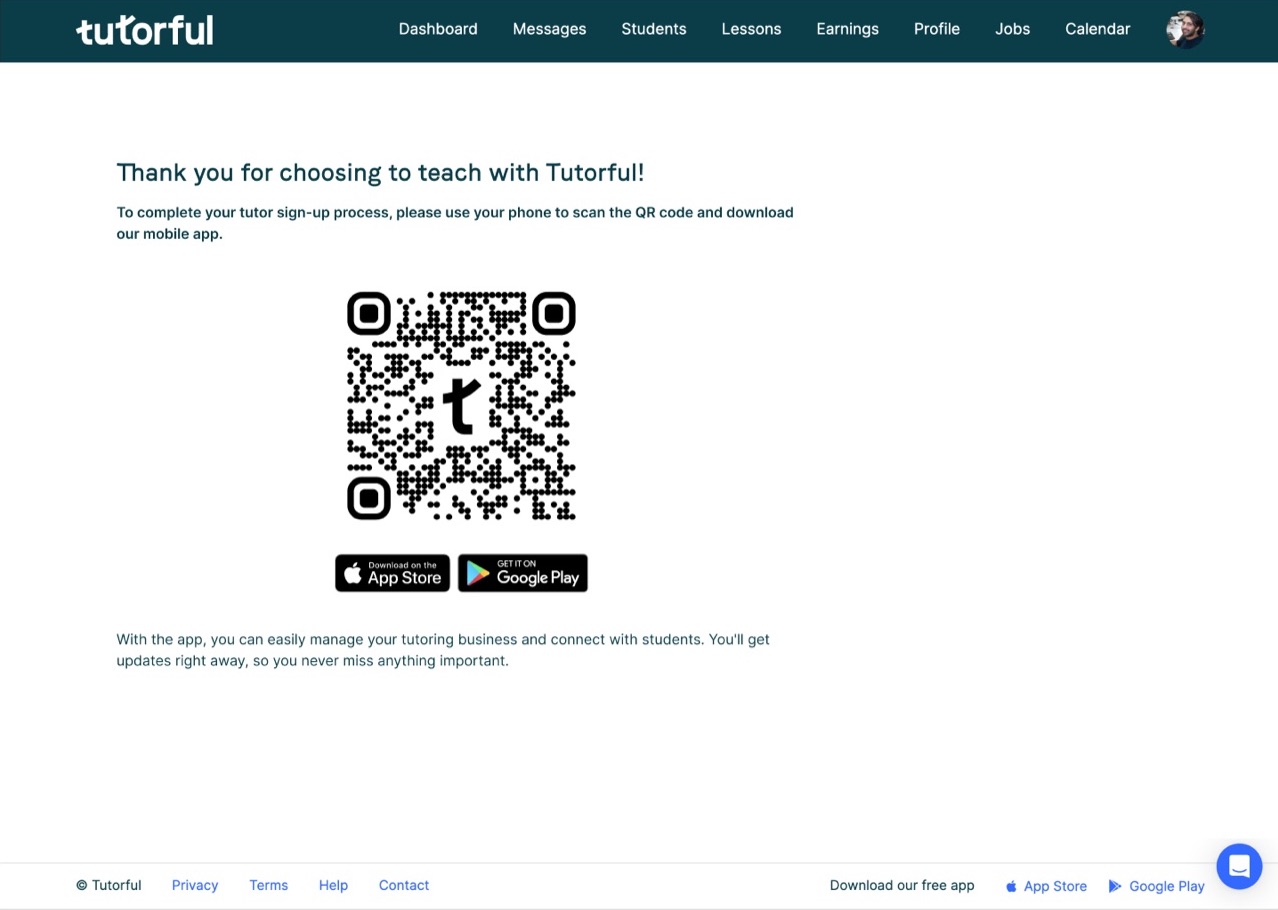
Tutors applied through a long mobile website with three competing calls to action, three different button colours, no progress indicator and an overcrowded profile page. People couldn't tell how far they had to go, or what they'd need.
Outcomes
- Onboarding moved into the iOS and Android apps as a step-by-step wizard
- 5 prospective tutors tested it on the staging app; 50+ observations coded
- 4 of the 5 major usability issues were fixed before launch
- Onboarding completion increased by 12% after launch
Chapter 2
Role & constraints
Product Designer, leading the redesign. I audited the existing flows, designed the wizard, wrote the copy for the primers, ran usability testing and did design QA with engineering. I worked with Katie Tynan (Product Manager) and the iOS and Android engineers.
- Compliance can't be skipped: identity verification and background checks are required.
- Familiar, not new: we reused the Tutorful design system and its principles (Crafted, Human, Familiar, Simple).
- Two platforms: the same flow had to work on iOS and Android.
Chapter 3
Discovery
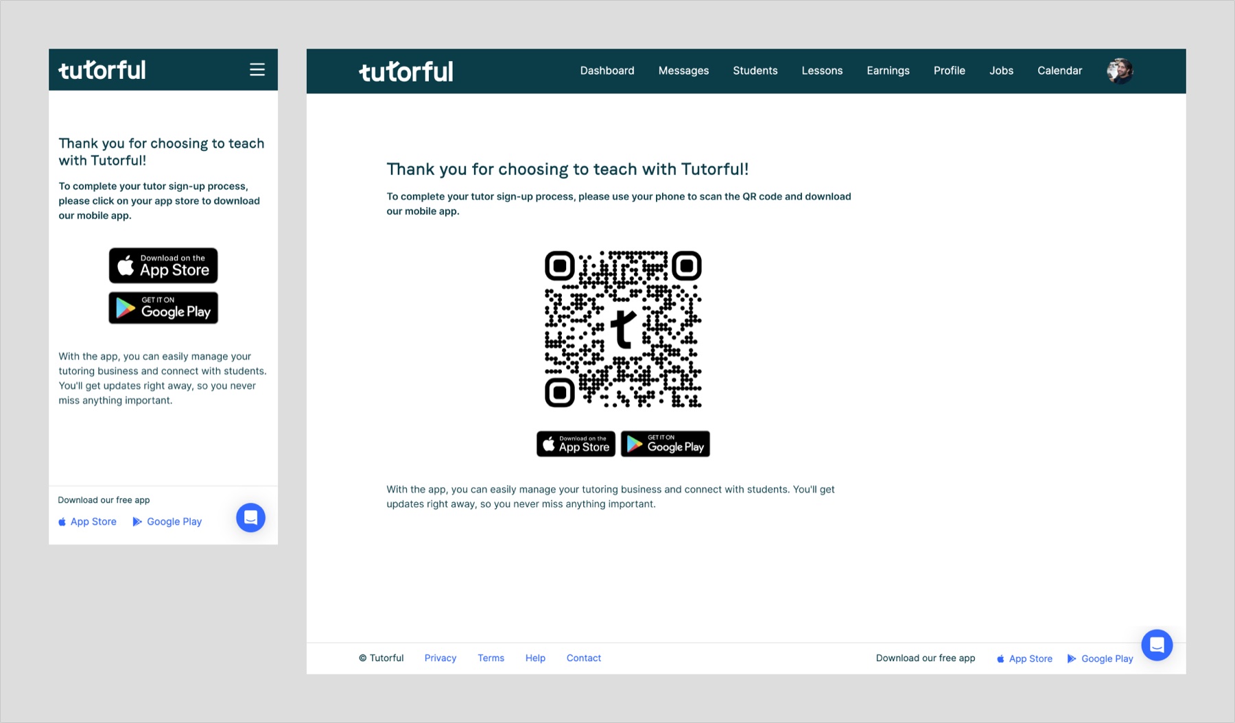
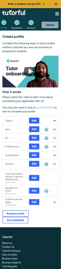
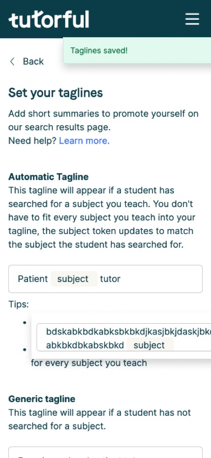
I audited the mobile web onboarding (24 Jan 2023) and the Android tutor app (31 Jan 2023), annotating every screen.

3.1Competing calls to action
The landing page had three ways to start: two "Start teaching" buttons above the fold and a "Become a tutor" button halfway down. The layout broke in places.
3.2No sense of progress
Nothing told tutors how many steps were left. The profile page mixed tabs, a referral banner and the Submit button in the same crowded space.
3.3Inconsistent UI
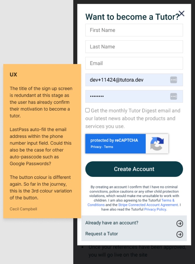
By the sign-up screen, tutors had already seen a third button colour. Small inconsistencies made the product feel less trustworthy, at the moment we were asking for passport details.
Chapter 4
Solution
4.1One wizard, clear stages
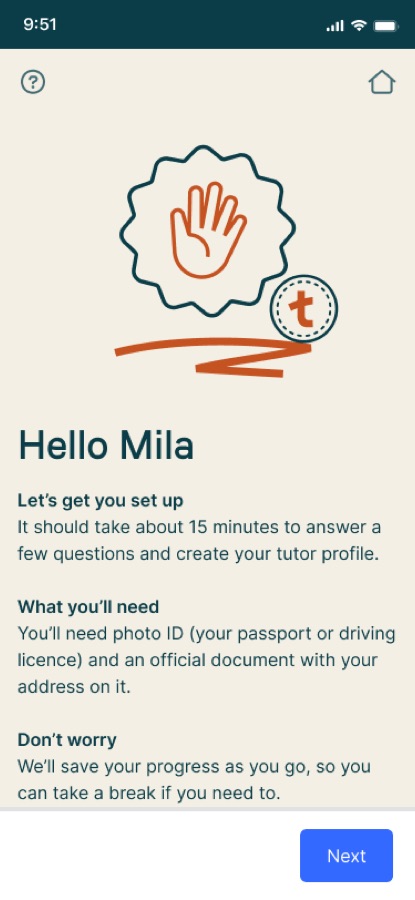
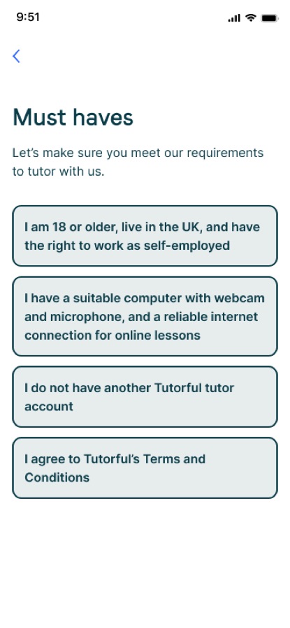
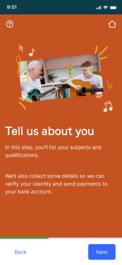
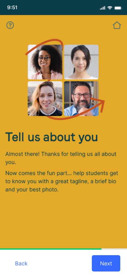
I broke onboarding into short steps, grouped into stages, each introduced by a primer screen that explains what's coming and what you'll need.
Getting started
Teaching
About you
4.2Primers set expectations
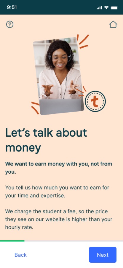
Before each stage, a primer tells tutors what it's for and what they'll need, in Tutorful's warm, plain voice. "It should take about 15 minutes. We'll save your progress as you go."
4.3Testing before launch
Five prospective tutors completed onboarding on the staging app while thinking aloud, then filled in a short survey. I coded every observation against four usability components: 23 learnability issues, 20 satisfaction issues and 9 efficiency issues, plus errors.
| What we found | What we changed |
|---|---|
| 80% struggled to scroll the identity verification page | Split it into two screens with clearer headers and a summary of details already entered |
| 100% felt stuck at the final screen | Added a message about what happens next, plus actions for unfinished steps |
| 60% saw cut-off copy on the very first screen | Logged with engineers and fixed |
| 100% found the bio step slow | Recommended finishing the bio while waiting for approval |
| 40% weren't sure tutoring-location cards were tappable | Added selection affordances |
4.4Design QA with engineering
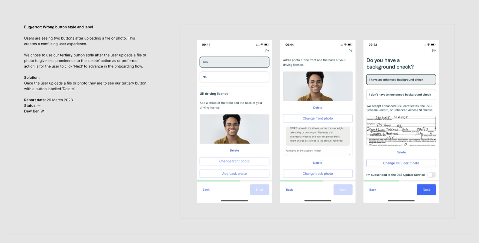
Before testing, I reviewed the staging build and logged eight issues, each showing the bug and the expected behaviour. Two examples: people kept tapping a disabled Next button, so we hid it and added a status banner; after an upload, Delete became a tertiary button so Next stayed the main action.
Chapter 5
Results
The wizard launched on iOS and Android in 2023. Onboarding completion rose by 12%, and tutors reached a live profile faster because they knew which documents to have ready before they started.
Chapter 6
Reflection
Test the build, not just the prototype. Design QA on the staging app caught 8 issues that never showed up in Figma, from spacing to keyboard behaviour and text cut off on smaller Android screens. Testing the real build is where the polish happened.
Expectations beat shortcuts. We couldn't remove the compliance steps, so we explained them. Primer screens telling tutors what was coming and what they'd need made the same number of steps feel shorter.
What I'd do differently. I'd test with tutors earlier, on prototypes rather than only on staging, so bigger structural issues could be fixed before build.