 Cecil Campbell
Pathways: AI-built courses that don't keep learners waiting
Turning a slow, manual course generator into a conversation that drafts, refines and starts teaching within minutes.
Chapter 1
Overview
Pathways is Grasp's AI course builder. A learner says what they want to learn, an AI mentor asks a few questions, drafts a course of modules and lessons, and revises it until the learner is happy.
The first version worked, but it felt slow and fragile. Learners stared at a spinner, had to press buttons to move the AI along, and couldn't tell whether anything was happening. My job was to make generation feel fast, honest and in the learner's control, on desktop and mobile.
The problem
Building a course took several manual steps and minutes of silent waiting. Learners had to trigger "write lessons" themselves, could only generate one module at a time, and got no sense of progress or of how long it would take.
Outcomes
- The first lesson is ready in about 3 minutes, and the rest of the course builds in the background
- Learners can close the tab: an email arrives when the course is ready
- The mentor can be stopped, edited and retried mid-response
- Fewer learners abandoned their course while it was generating
Chapter 2
Role & constraints
Product Designer, and the only designer at Grasp. I led Pathways end to end: discovery, journey mapping, user flows, UX/UI for desktop and mobile web, the AI mentor's states, and reviewing builds before release. I worked directly with the founder, university professors and the engineering team in one-week delivery cycles, and sat on Product Owner recruitment panels to bring a UX perspective to hiring.
2.1How I worked
Research into decisions
Co-led discovery through learner interviews and performance analysis, and turned findings into product priorities with the founder.
Diverse, hard-to-reach learners
Helped set up learner communities in Bengaluru and Hyderabad, bringing insights from international learners back into the product.
Prototype, test, iterate
Tested concepts early with rapid prototypes, iterating in one-week cycles rather than waiting for a big release.
Quality through delivery
Reviewed builds against the designs before release, and used the shared shadcn/ui-based design system so new screens stayed consistent.
- AI is slow and unpredictable. Generation takes minutes, responses stream in, and the model can fail at any point.
- Learners arrive with a goal, not a syllabus. The product has to do the structuring for them.
- Mobile web matters. Every flow had to work on a phone, not just desktop.
Chapter 3
Discovery
3.1The end-to-end user flow
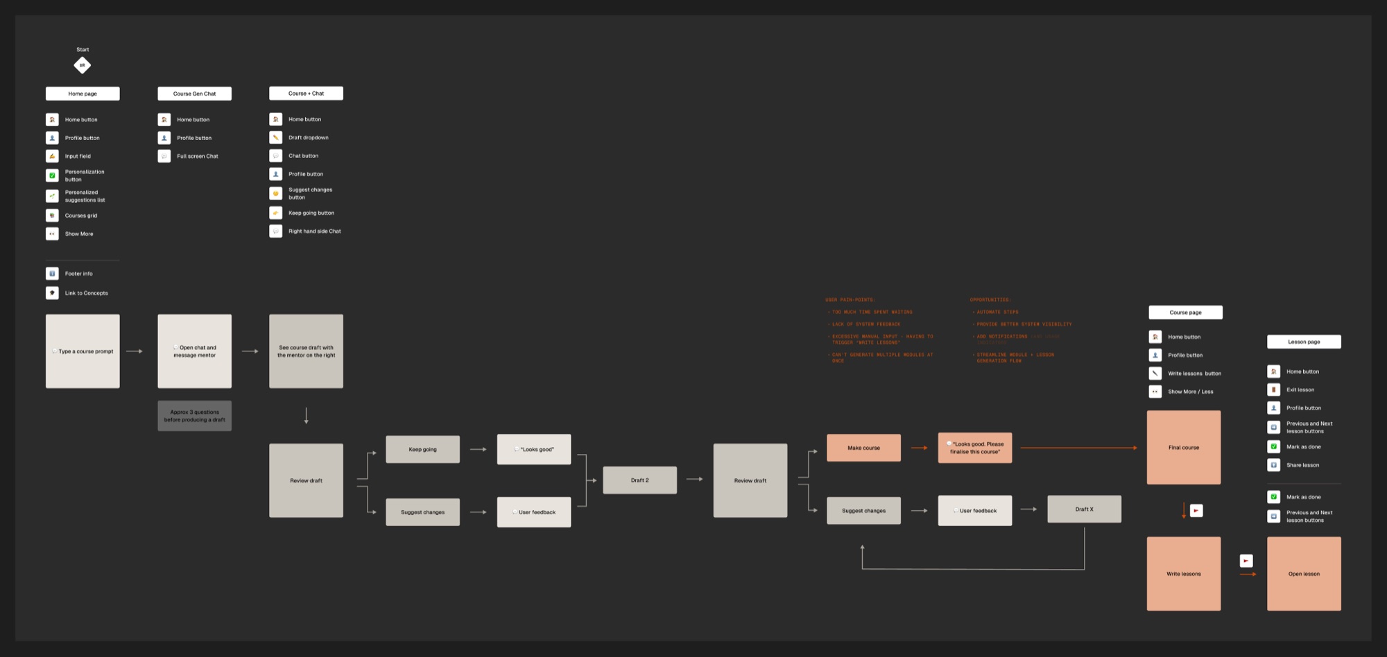
I started by mapping the whole service, not just the screen we were asked to fix: from landing on Grasp to building a second module. New and returning learners take different routes in, then share the same path through course generation and learning.
3.2Mapping the learner's journey
Then I mapped how that flow felt to a learner, stage by stage, using what learners told us in interviews. The emotional low point was obvious: the wait between agreeing a course and being able to start it.
Archetype: a self-directed learner. Wants a short course on a topic they care about, fitted around work.
I mapped every screen and action in the existing flow, from the homepage prompt to opening the first lesson, and marked where learners got stuck.
3.3Too much time spent waiting
A course took minutes to generate, and the screen gave nothing back. In my notes, the learner's needs during those minutes were blunt: I don't know roughly how long this will take. I don't have a sense of progress. I don't know how good it will be.
3.4Excessive manual input
After approving a draft, learners had to press "Make course", then press "Write lessons", and could only generate one module at a time. The AI was waiting on the learner, and the learner was waiting on the AI.
Before
After
3.5The mentor was hard to find
Inside a lesson, the AI mentor sat behind an unlabelled icon in the corner. Learners with a question didn't know they could ask one.
Chapter 4
Solution
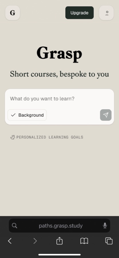
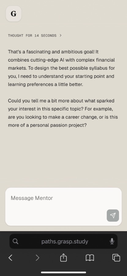
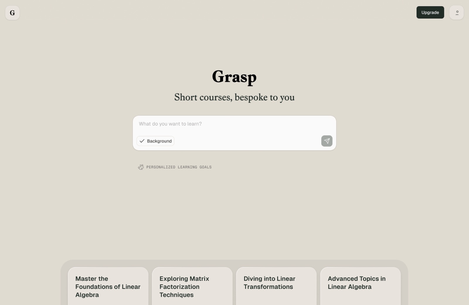
4.1Build a course through conversation
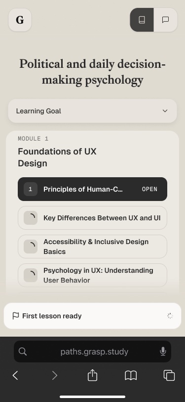
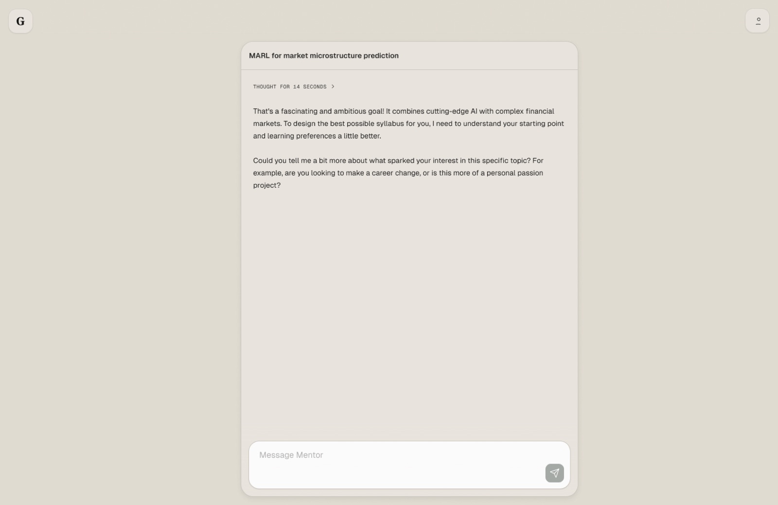
Learners start with a goal in plain language. The mentor shows that it's thinking, asks a few questions, then responds with a plan. The same flow works on a phone.
4.2Drafts beside the chat
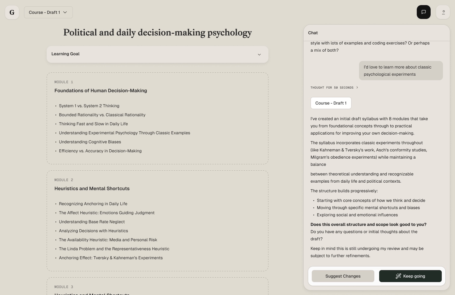
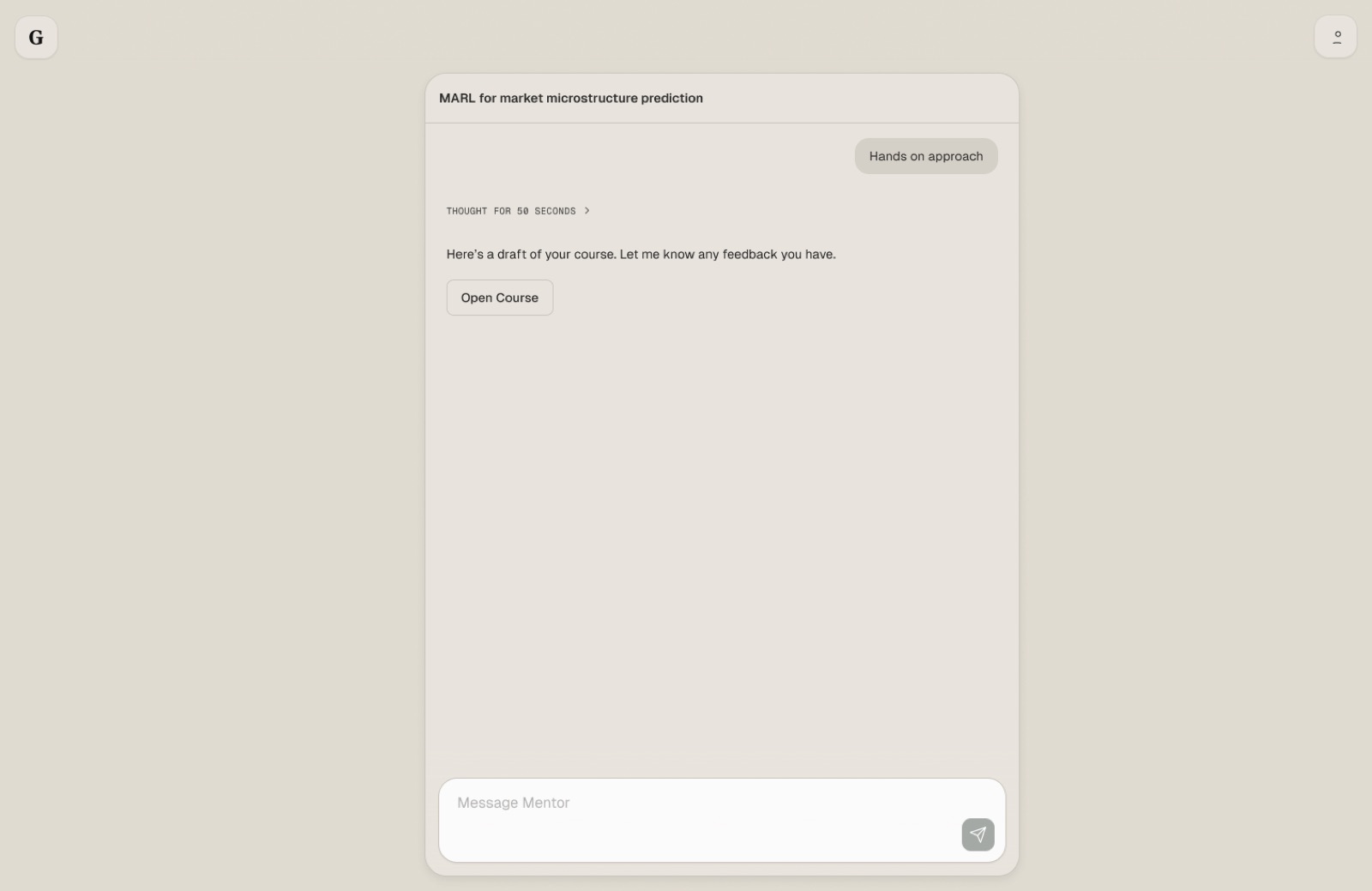
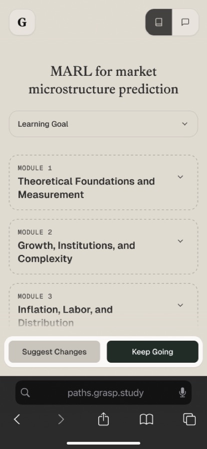
Each draft opens next to the conversation, so learners can read the course and talk about it at the same time. A few rules kept this calm:
- Always show the action bar on drafts: Suggest changes or Keep going.
- Always keep the chat input visible, but disable it while the mentor is thinking.
- Notify learners when a new draft arrives if they switched views with the toggle rather than the message button.
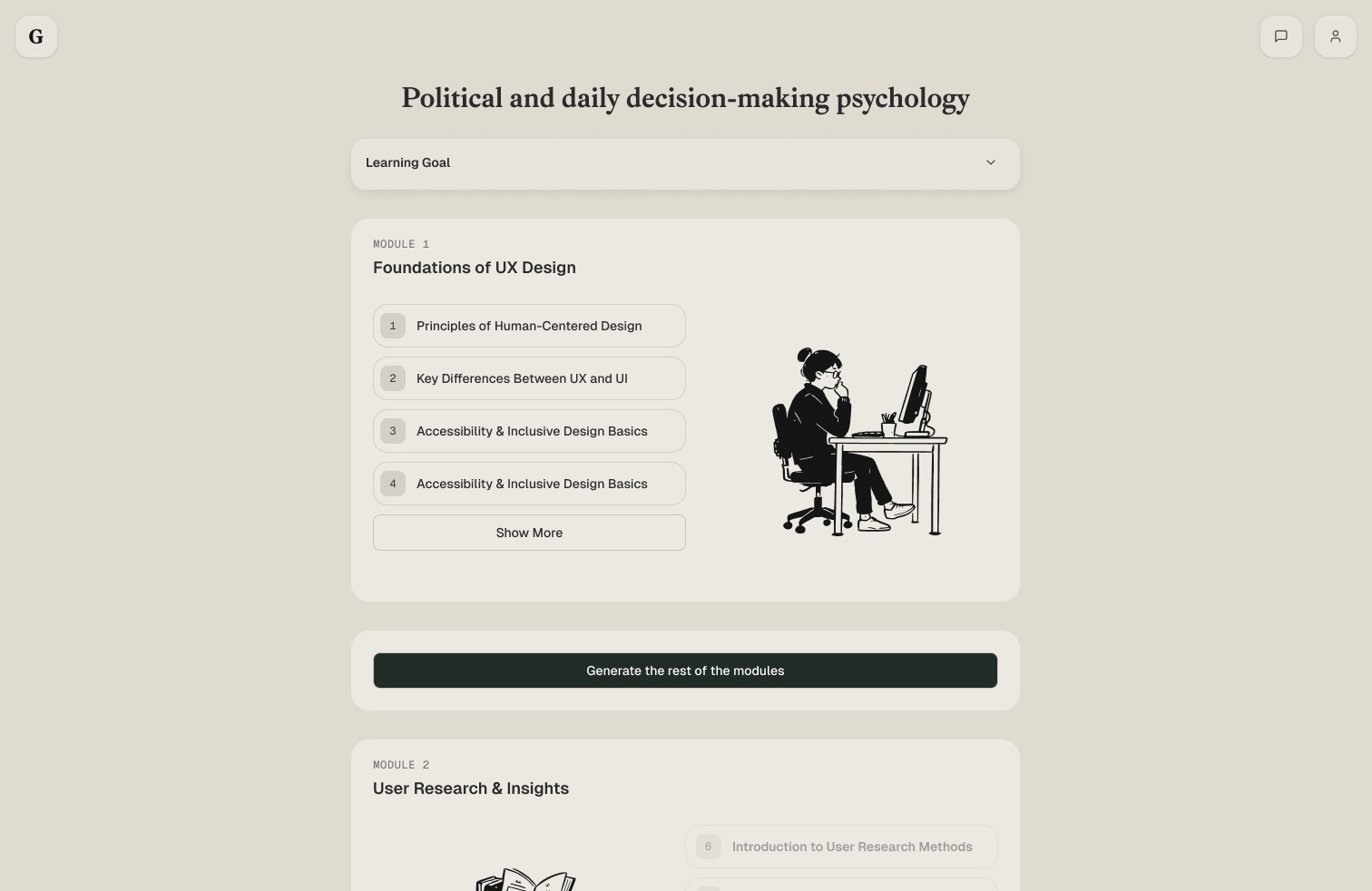
4.3A course skeleton instead of a spinner
Instead of generating everything before showing anything, Pathways now shows the whole course structure straight away and writes Module 1 first. Later modules appear as greyed-out outlines, and one button generates the rest.
The waiting itself became honest. Four messages had to reach the learner:
No more input needed
The learner's job is done; Pathways takes it from here.
First lesson in ~3 minutes
A concrete time, not a spinner.
Safe to close the tab
Nothing is lost if they leave.
Email when it's ready
So they come back at the right moment.
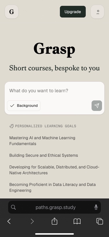
1Set a goal
Personalised suggestions under the prompt
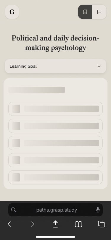
2Structure appears
A skeleton instead of a blank screen
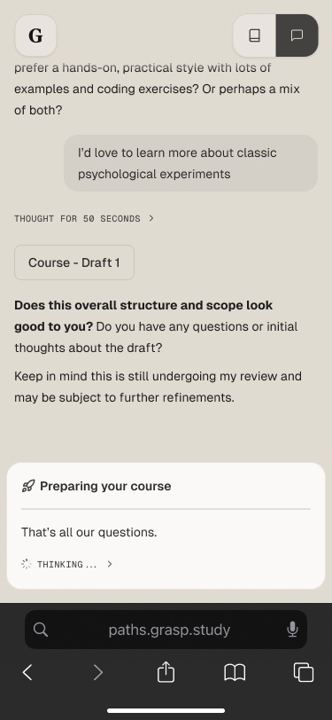
3Preparing your course
The mentor says what's happening
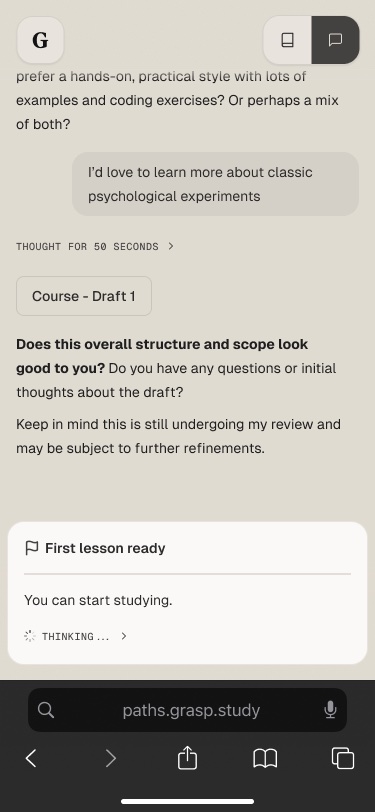
4First lesson ready
A clear moment to start
5Start Module 1
Later modules keep building
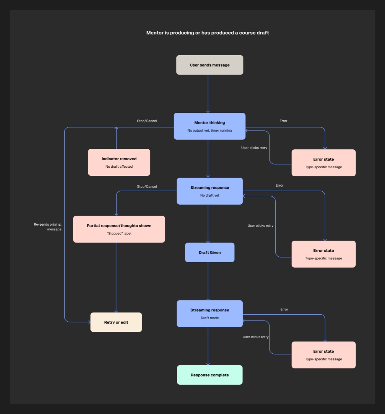
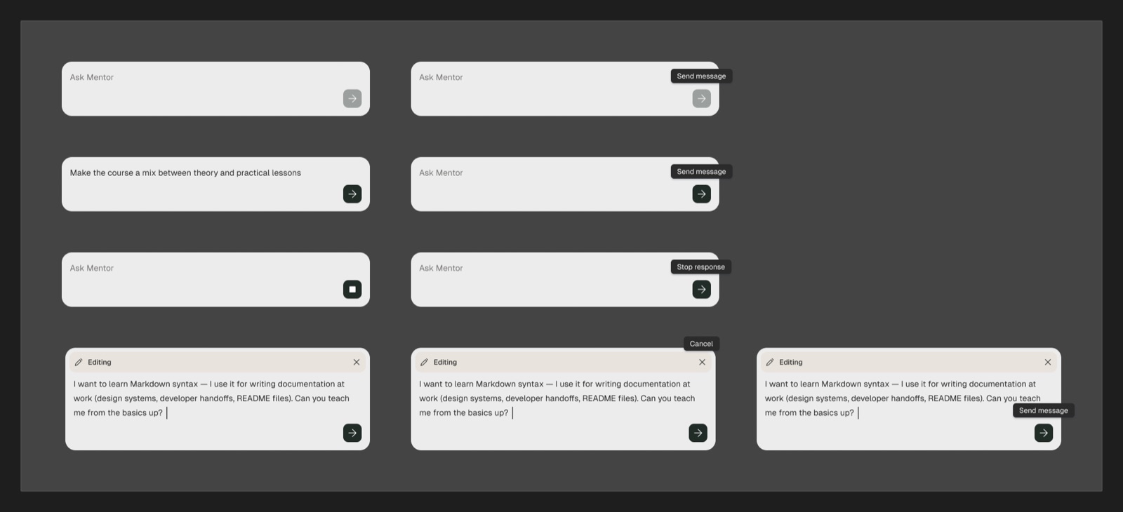
4.4A mentor you can stop and correct
AI responses can be slow, wrong or fail outright. I mapped every state the mentor can be in, so learners always have a way out: stop it, edit the message, or retry.
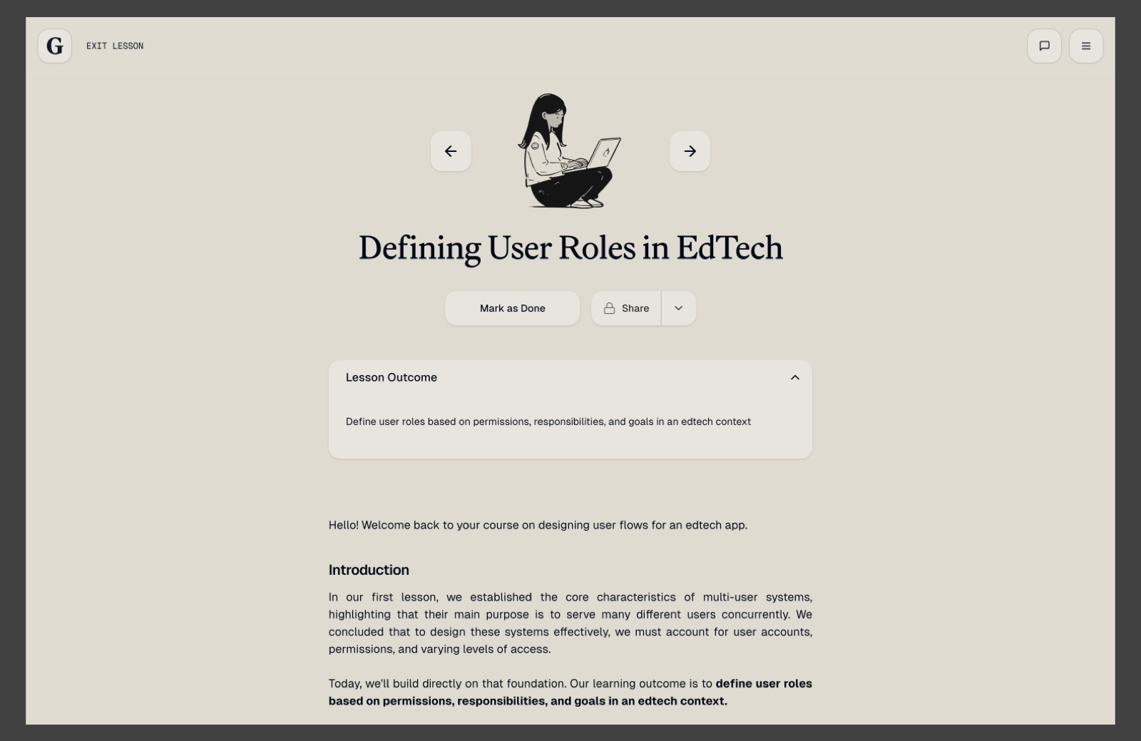
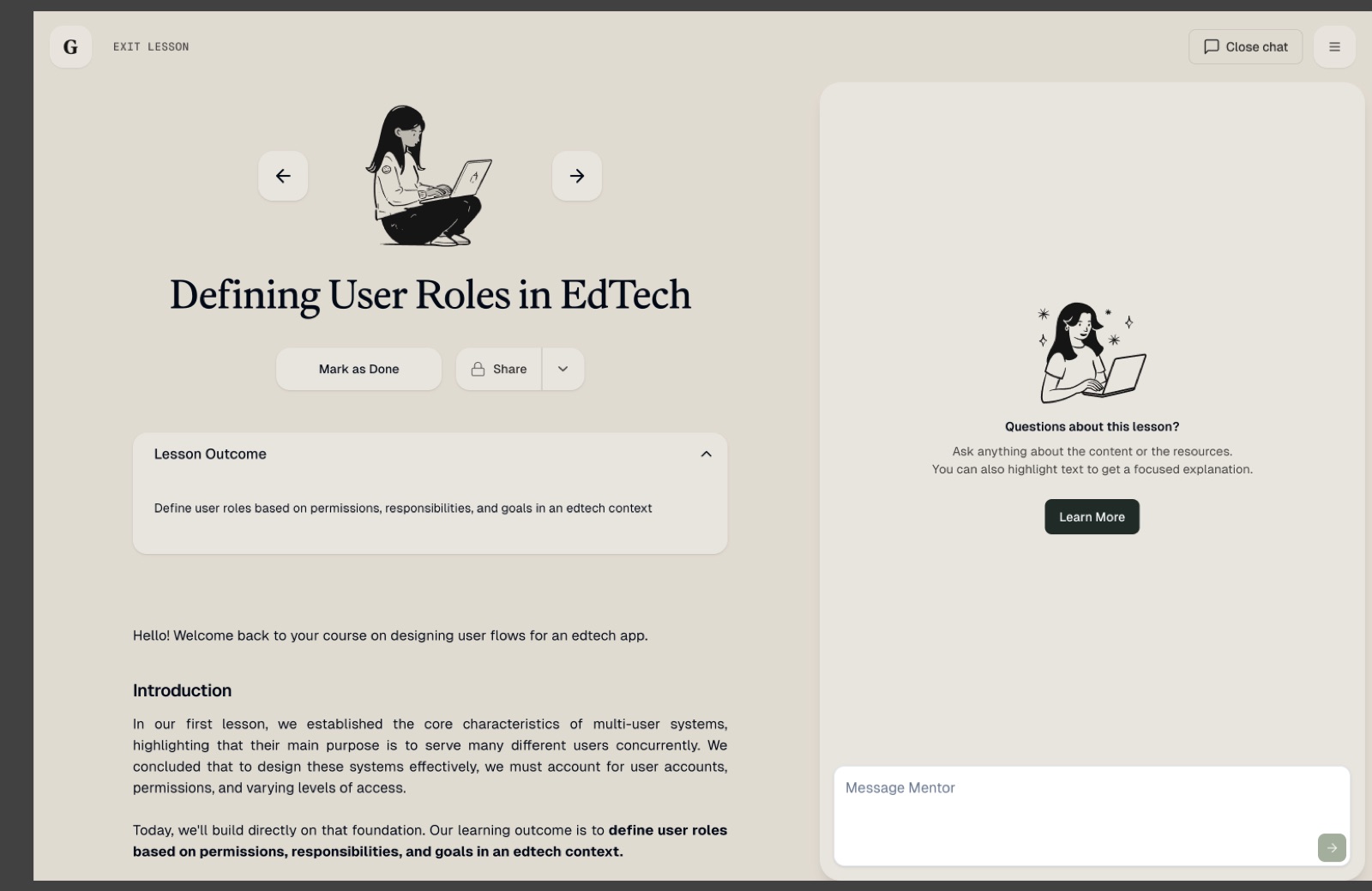
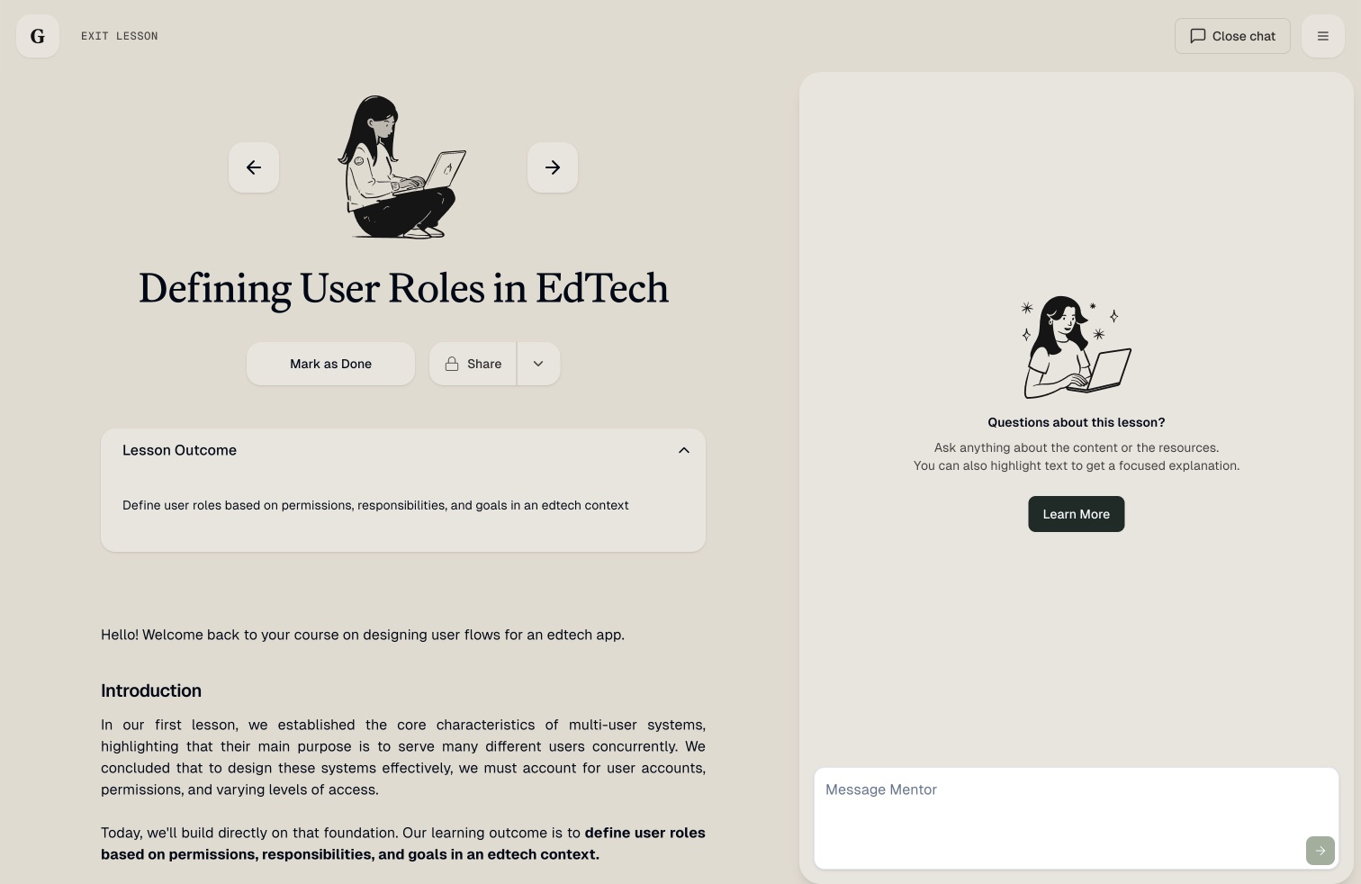
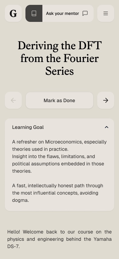
4.5Making the lesson mentor discoverable
In lessons, the unlabelled icon became an Ask your mentor button. It opens a side panel with an empty state that explains what to ask, and learners can highlight text to get a focused explanation.
4.6Edge cases: limits and errors
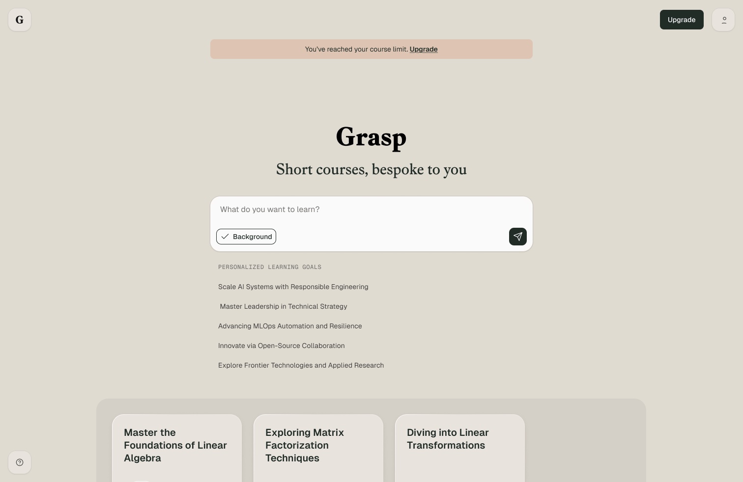
Free learners hit a course limit. Rather than blocking the homepage, a quiet banner explains the limit and offers an upgrade, while their existing courses stay one click away.
4.7Accessible AI, by design
Streaming AI is a hard case for accessibility: content moves, timing is unpredictable, and status often lives in an animation. These decisions kept Pathways usable for everyone, with WCAG 2.2 AA as the bar:
| Decision | Why it matters | WCAG 2.2 |
|---|---|---|
| Learners can stop the mentor mid-response | Moving, auto-updating content can be paused | 2.2.2 Pause, stop, hide |
| Progress and time estimates are written messages, not just a spinner | Screen-reader users hear what's happening | 4.1.3 Status messages |
| The mentor icon became a labelled "Ask your mentor" button | Its purpose is clear to everyone, including voice-control users | 2.5.3 Label in name; 2.4.6 Headings and labels |
| Every flow works on a phone, down to small screens | No horizontal scrolling or lost content | 1.4.10 Reflow |
| Learners can close the tab and get an email when the course is ready | No time pressure while the AI works | 2.2.1 Timing adjustable |
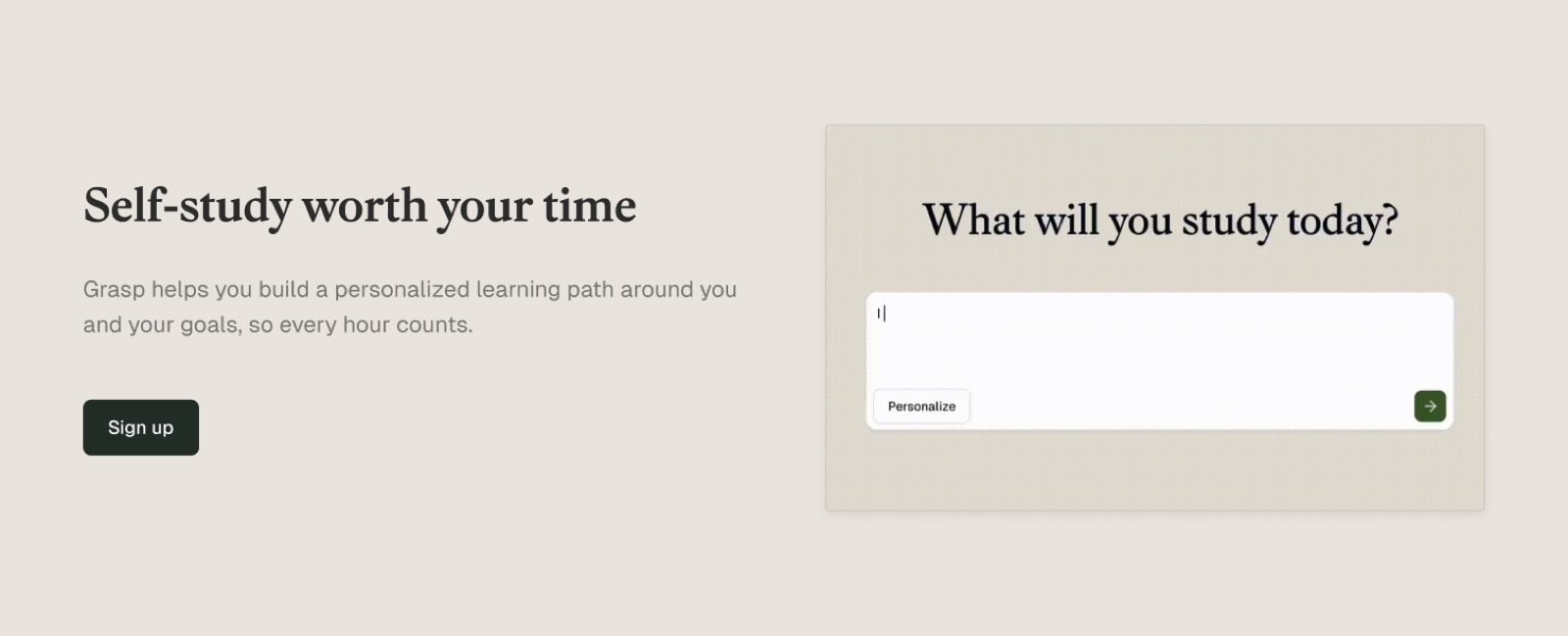
4.8Landing page
A responsive marketing site built from the same components, at four breakpoints.
Chapter 5
Results
Fewer learners dropped off while their course was building, and more of them went on to finish Module 1. The conversational builder, background generation with an email when the course is ready, and the mentor's stop, edit and retry states shipped to all learners in 2026. Next on the roadmap was generating several modules in parallel, so learners would never wait between modules.
Chapter 6
Reflection
Design the wait, not just the result. With AI, latency is part of the product. Showing progress, giving an honest time estimate and letting people leave and come back did more for how fast it felt than any change to the model.
Keep the learner in control. Streaming responses feel alive, but they feel out of control when they go wrong. Stop, edit and retry let learners steer the mentor instead of starting again, and made the AI feel like a collaborator.
Tell the story, not just the spec. Mapping the journey and showing the waiting screen next to what learners told us made the case for background generation faster than any requirements document. The founder and engineers could see the problem, so we agreed the fix in a single session.
What I'd do differently. I'd measure the generation flow from day one. We had strong signals from interviews early on, but no baseline for drop-off until later, which made the improvement harder to put a number on.