 Cecil Campbell
Experian: a homepage that explains before it sells
Redesigning experian.co.uk and the free product page to help visitors understand, then sign up for, the free account or CreditExpert.
Chapter 1
Overview
Experian Consumer Services was redesigning the experian.co.uk homepage to bring it closer to its message in the market, and to make room for new products and features.
The problem
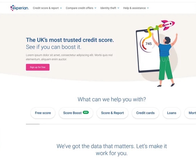
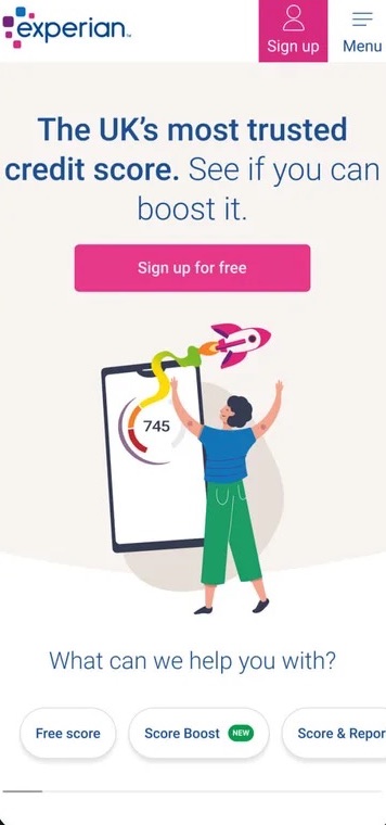
The homepage had to do two jobs at once: educate people about credit scores, and convert them to the free Experian account or the paid CreditExpert subscription. The old homepage tried to say everything at once: too many products competed for attention, and the free credit score, the main reason people visited, was easy to miss on mobile.
Outcomes
- A new homepage built around the free credit score
- A redesigned free product page
- Reusable content components for testing with the Optimisation team
- Free account sign-ups from the homepage rose by 6% in A/B testing, with no drop in CreditExpert trial starts
Chapter 2
Role & constraints
As Senior Digital Designer, I was one of three designers, working with Experian's Optimisation team. I also redesigned the free product page as a side project.
- Regulated product: credit information needs careful, accurate wording.
- Testing culture: designs went through the Optimisation team, so components had to be testable on their own.
- Shared design system: the homepage had to use Experian's existing components and sit comfortably alongside pages owned by other teams.
Chapter 3
Discovery
I started with analytics and existing research. Most visitors came for one thing, their credit score, and more than half of homepage visits were on mobile. Many existing customers used the homepage only to log in. A review of competitors such as ClearScore and Credit Karma showed them leading with the free score and keeping paid upgrades secondary.
Visitor journey
Chapter 4
Solution
4.1A homepage that leads with the free score
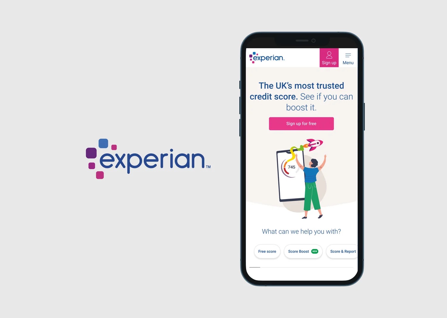
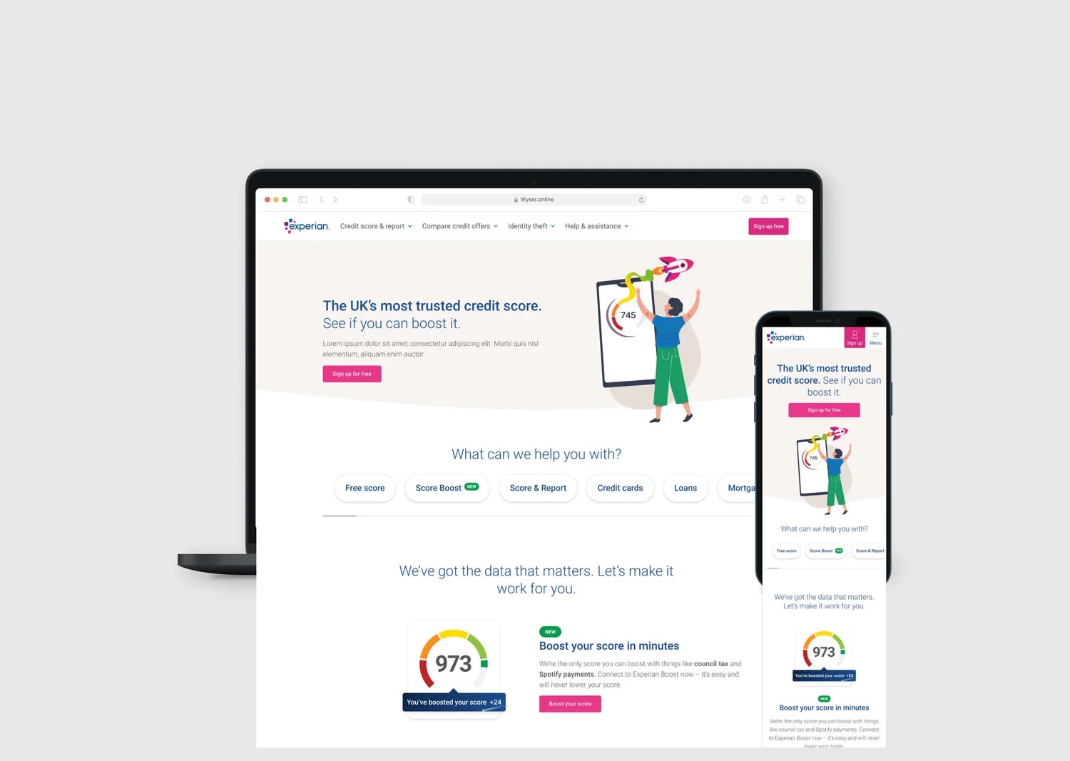
The new homepage leads with what most visitors come for, the free credit score, and makes the next step obvious on every device.
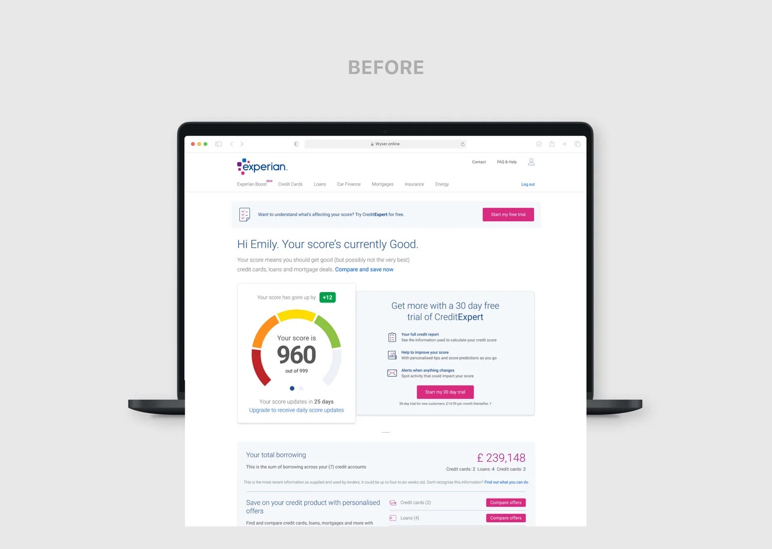
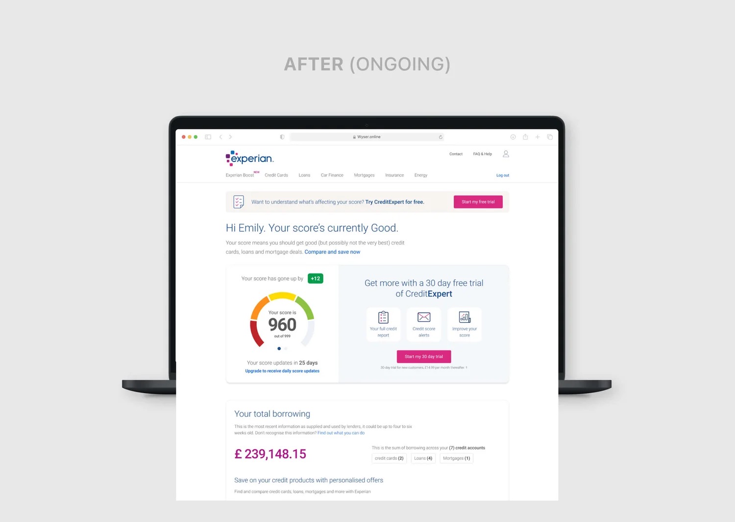
4.2Free product page
The free product page was rebuilt from modular sections that explain the benefits plainly and repeat the call to action.
4.3Reusable components
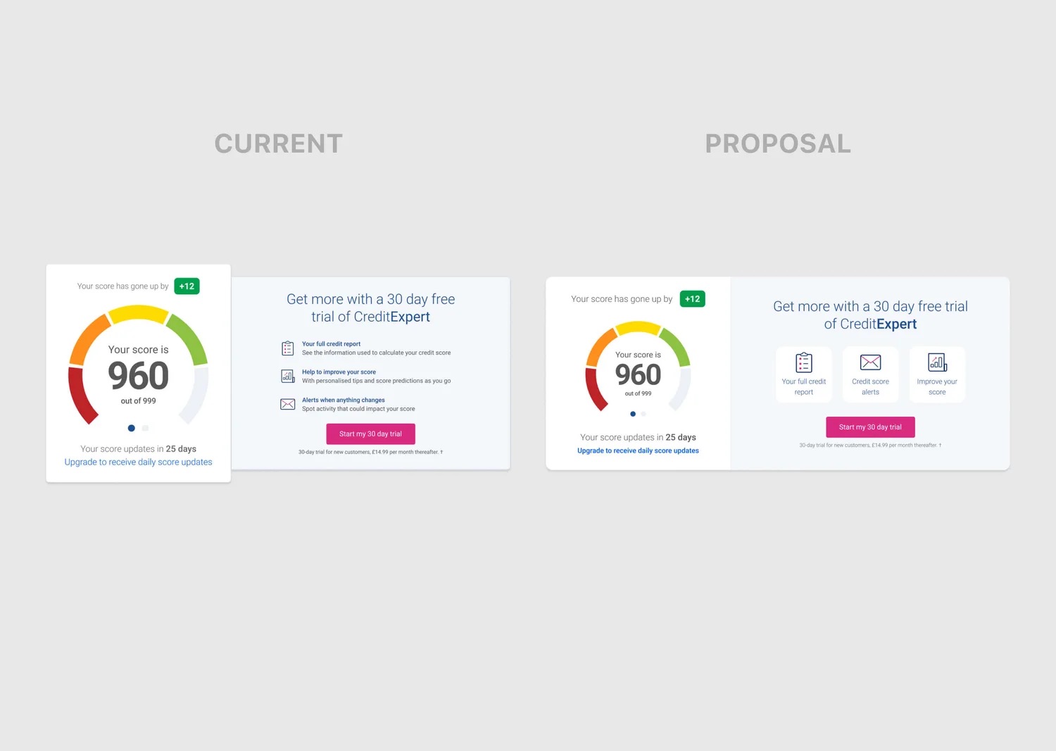
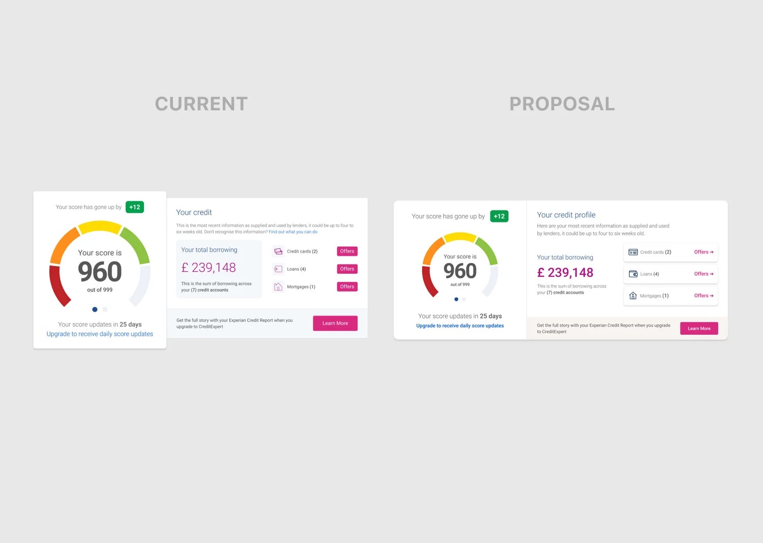
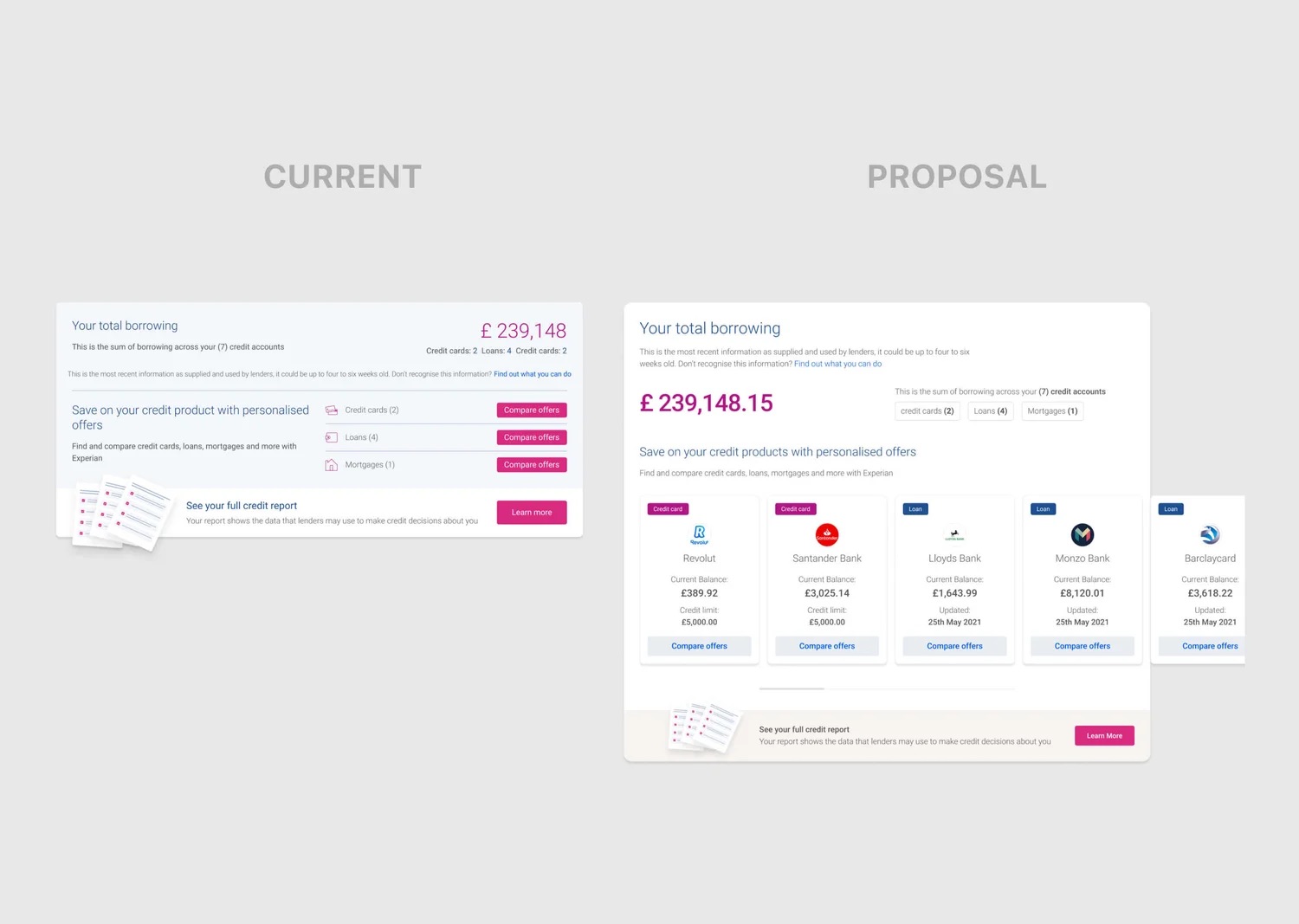
Each section was designed as a component the Optimisation team could test and reuse.
Chapter 5
Results
The new homepage increased free sign-ups without taking anything away from CreditExpert: paid trial starts held steady. The test ran for four weeks with Experian's Optimisation team.
Chapter 6
Reflection
Designing with an Optimisation team. Designing for testing changed how I worked. Every section had to make sense on its own so it could be tested, swapped or reordered, which pushed me towards modular components and a clear hypothesis for each change.
What I'd do differently. I'd pair the A/B tests with qualitative research. The numbers told us which version won, but not always why.